PCH NXP : Defining a New Winning Experience

Improving Trust for Users and Growing a Younger Demographic
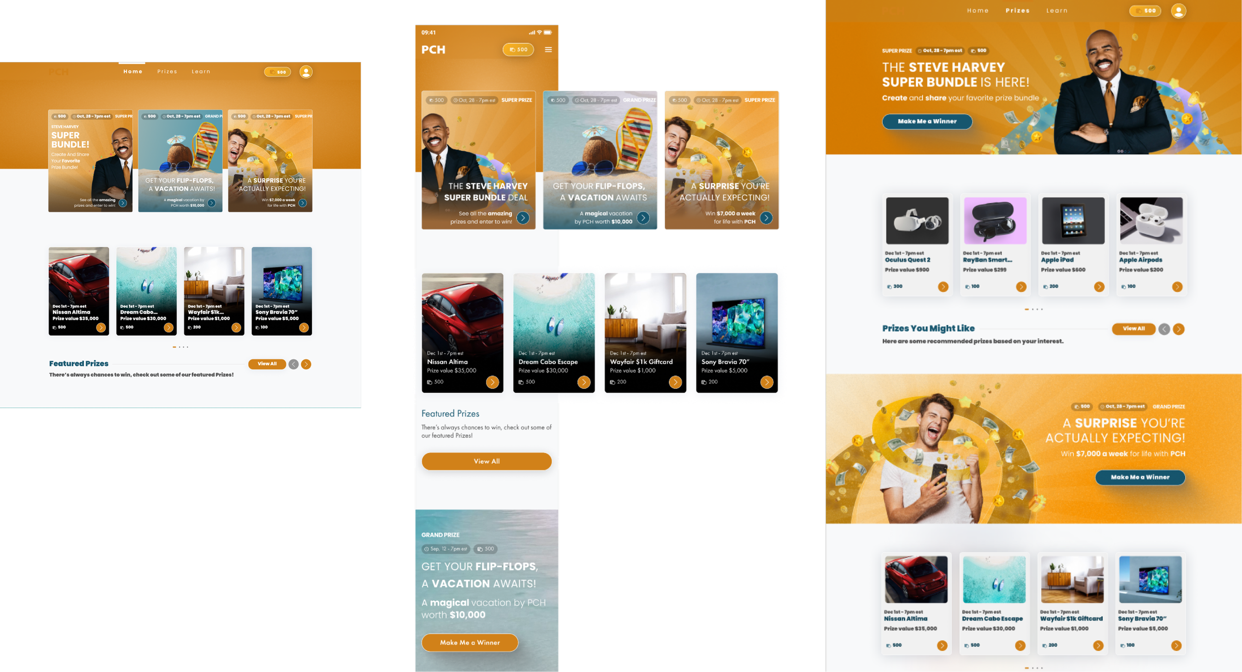
Building on previous insights indicating positive user responses to real winners' imagery, a collaboration with the product team led to the strategic decision to revamp the site's visuals.
This involved aligning the imagery to reinforcing trust and enhancing the overall user experience in order to capture a younger demographic.
My Role
Product Strategy • UX Strategy • Product Design • UX Research
Team Members
Davidson Adames - Design Lead
Christian Castellanos - Director of Product Design
Aldo Santa Ines - Director of User Experience
Methods
UX Strategy • UX Research • Research Synthesis • Analytics • Creative Ideation • Data Focused Design
Project Date
October 2021 - October 2023
The Problem
Publishers Clearing House had traditionally done well with the 65+ age demographic, but struggled to attract a younger audience.
One of the goals of this project was to expand the appeal of PCH to a demographic that by and large did not engage with the company.
The goal
We wanted to expand our age demographic to include a younger audience - specifically the 25 to 34 and 35 to 44 age range.
The KPIs we were looking to improve were:
Time on Site
Account Registration
Prize Entries
the outcome - what did we achieve?
In order to determine the effectiveness of our new creatives, we ran an A/B test of the live site. This test took place over the course of a week using Adobe Test and Target.
25 to 34 age range:
Time On Site : 53% increase
Entries : 45% increase
Account Creation : 62% increase
35 to 44 age range:
Time On Site : 44% increase
Entries : 57% increase
Account Creation : 75% increase
The outcome of the testing made it quite clear that the advertisements worked effectively. Beyond this, our plan was to create and use our own images (not stock photos) and replicate poses that we found to be effective.
We had also determined a testing strategy in order to determine whether or not the images captures by the advertising department would work - from there we would be able to refine and address any issues.
Where DID we begin? Defining The Issue
Shifting Age Demographics and Building Trust: What Does Winning Look Like?
Building trust emerged as a primary goal within this project's scope. User testing unveiled a prevalent sense of caution and reluctance among users, particularly regarding the legitimacy of winning opportunities on the site.
Previous testing had shown that users responded more positively to images portraying real winners, reinforcing trust and evoking genuine excitement.

Research Approach
Can We Determine What Winning Looks Like?
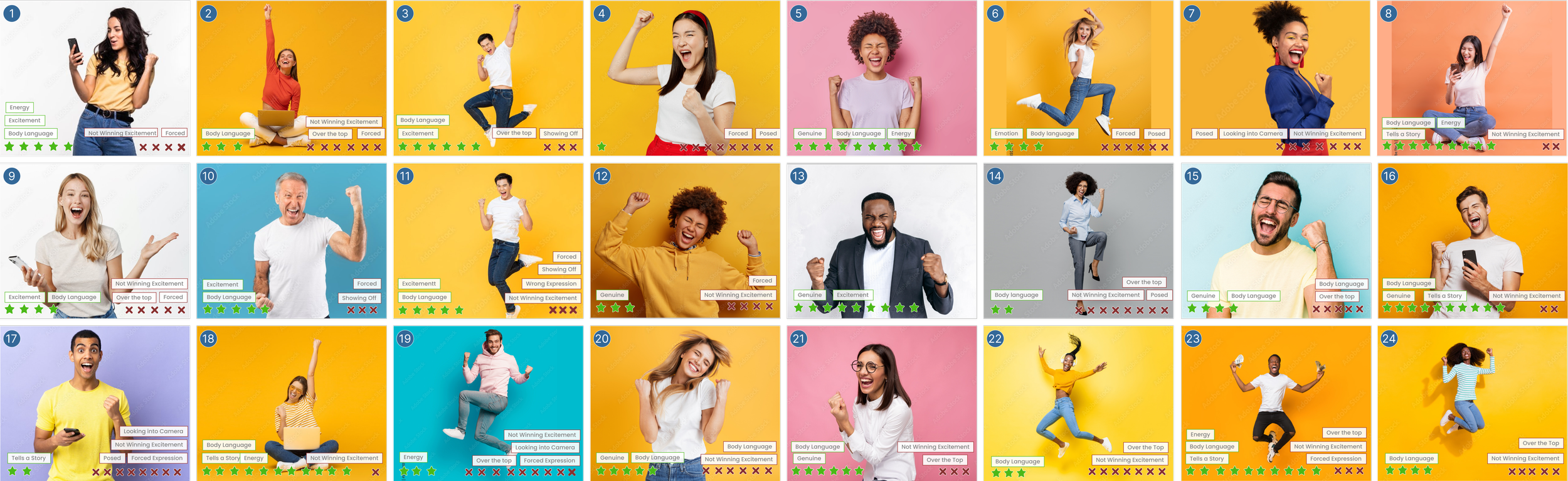
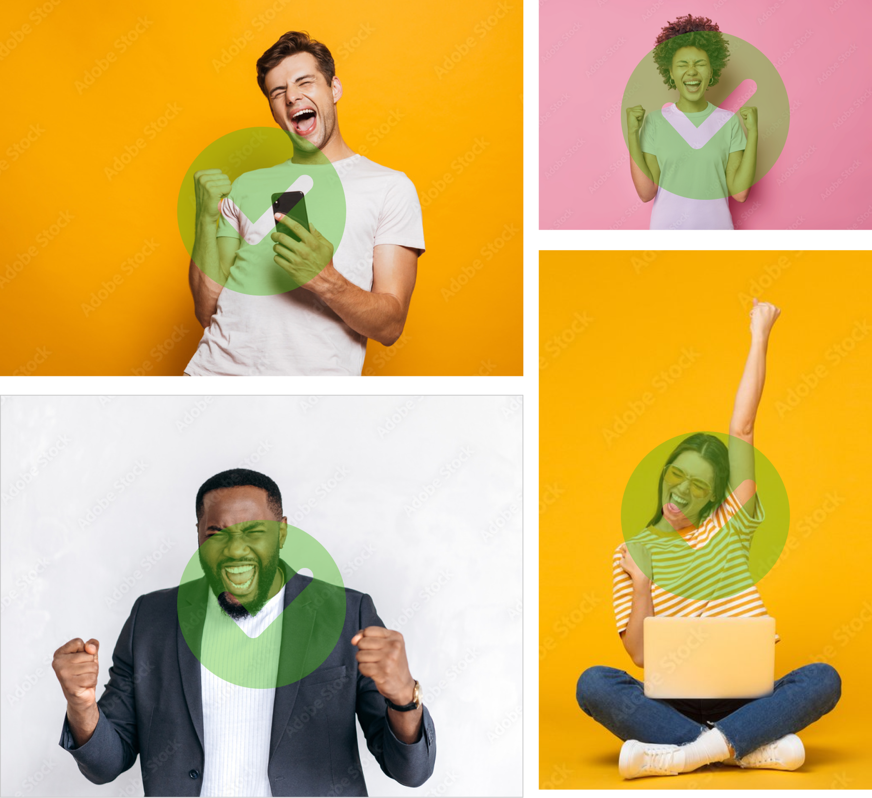
To better understand our target demographic, we collected stock images featuring various gestures, facial expressions, and mannerisms. We also placed different colored backgrounds behind each model.
We ran multiple rounds of tests where users were showed 5 blocks of 6 images and we asked a very straightforward question:
“Which images, if any, do you associate with winning and which feel disingenuous? Please explain your choices.”
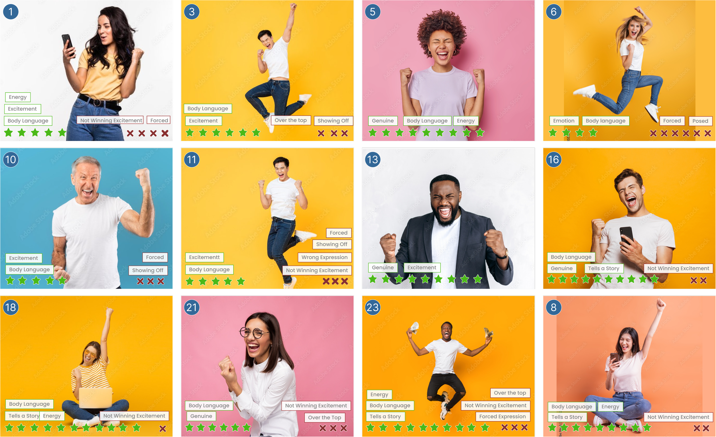
What Does “Winning” Look Like?
What keywords did users vocalize?
Through testing, we compiled a list of keywords mentioned by our users when describing what they considered genuine versus disingenuous.
Winning is relatable and tells a story through body language that feels authentic and genuine.
Key words and phrases:
energy
body language
excitement
tells a story
What Doesn’t “Winning” Look Like?
What keywords did users vocalize?
Through testing, we compiled a list of keywords mentioned by our users when describing what they considered genuine versus disingenuous winning.
Winning is not posed and over the top, it shouldn’t feel forced or staged.
Key words and phrases:
over the top
posed
forced
not genuine
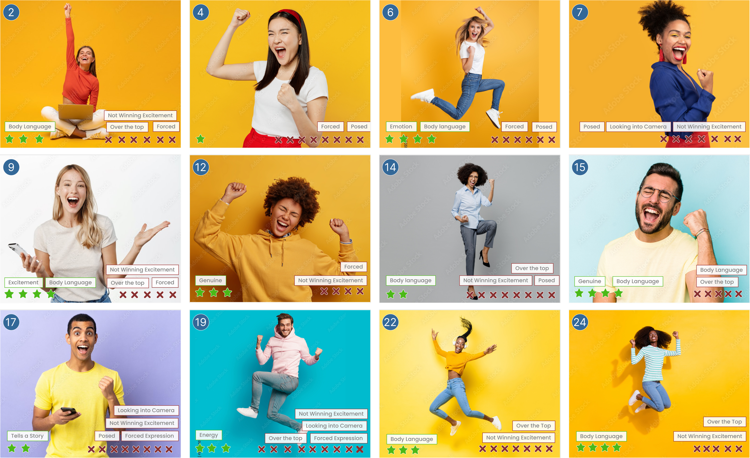
Results: What “Winning” Looks Like & Determining Images Further Testing
Testing determined what winning looked like - relatable and tells a story through body language that feels authentic and genuine - and what winning didn’t look like - not posed and over the top, it shouldn’t feel forced or staged.
With those ideas in mind, the next step was to run a ranked choice test to determine which of the highest scoring images we were going to use in ad mock ups.
Next Steps - Placing images in context
After determining what our top images were we developed a testing protocol where the images were placed in ads. We decided that three tests would be appropriate in deciding which ads would be successful and the most impactful.
Part of our goal was to determine whether or not our images and ads would test better than the current ads and then other ads that we had designed that did not include people in them.
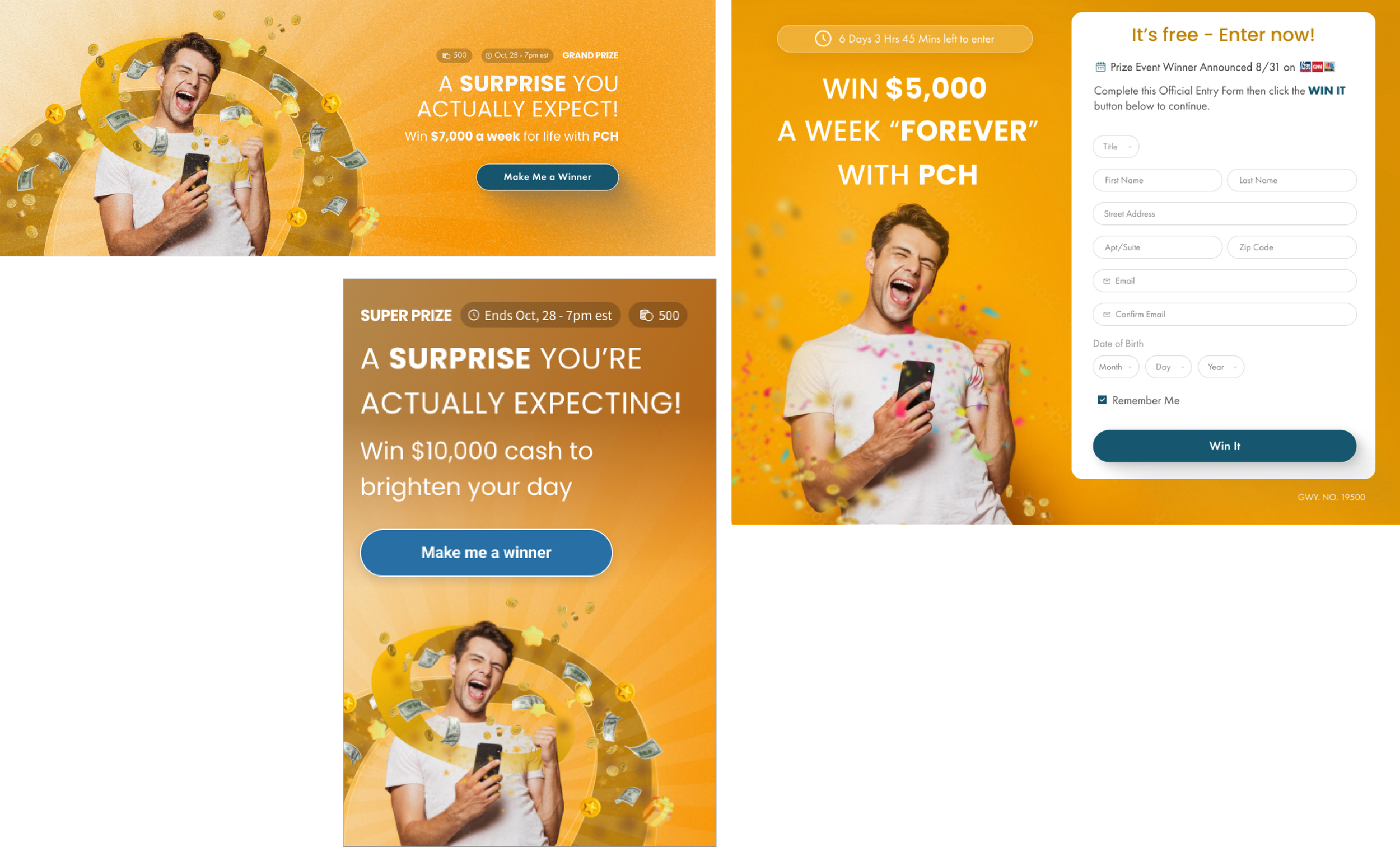
The Testing Process
Test #1:
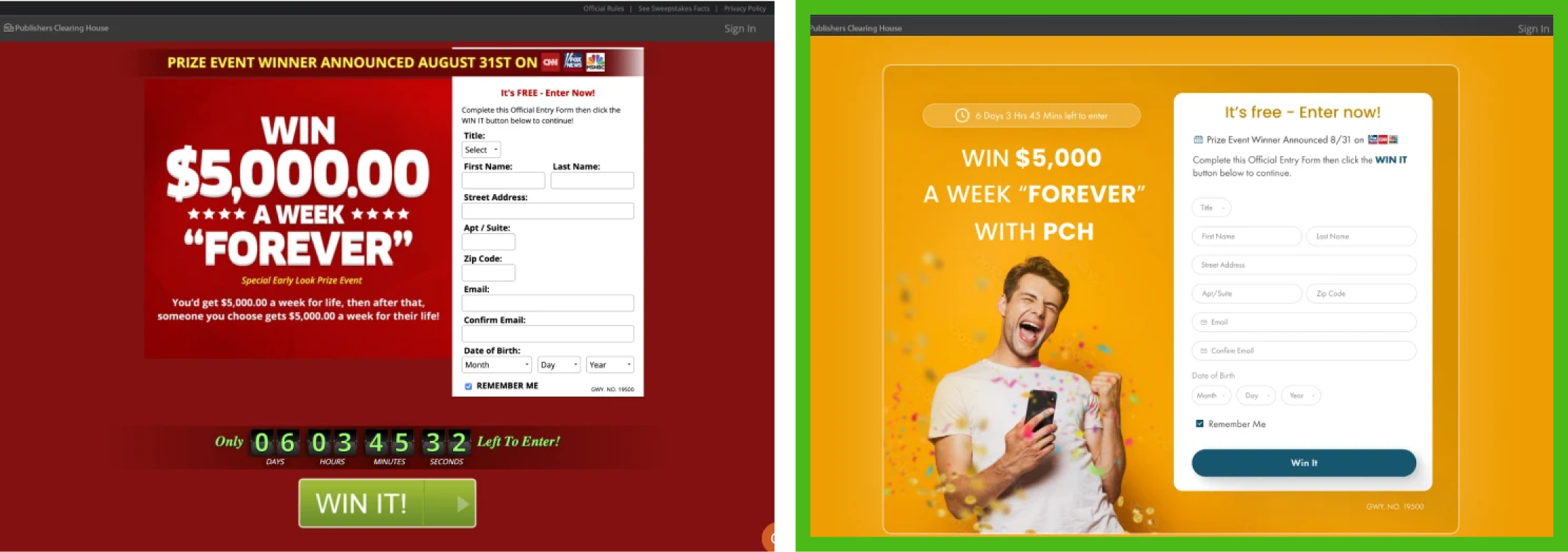
A second head to head test; however, while this test also involved enticing people to enter to win a cash prize, it involved an account registration form instead of a CTA.
Test #2:
Head to head with the same PCH ad from the first test.
These ads were used to entice people to enter to win a cash prize by clicking a CTA.
Test #3:
Ranked choice with four advertisements: three ads were net-new that were created by our media team and one ad PCH had been running for an extended period of time as a control.
These ads were used to entice people to enter to win a cash prize by clicking a CTA.
Test #1 - Head to Head
Testing Demographics (500 Responses):
Male and Females 18-65+; Household income $20k to $80k.
Users were asked:
Please rank the following digital ads and tell us why you made your decision.
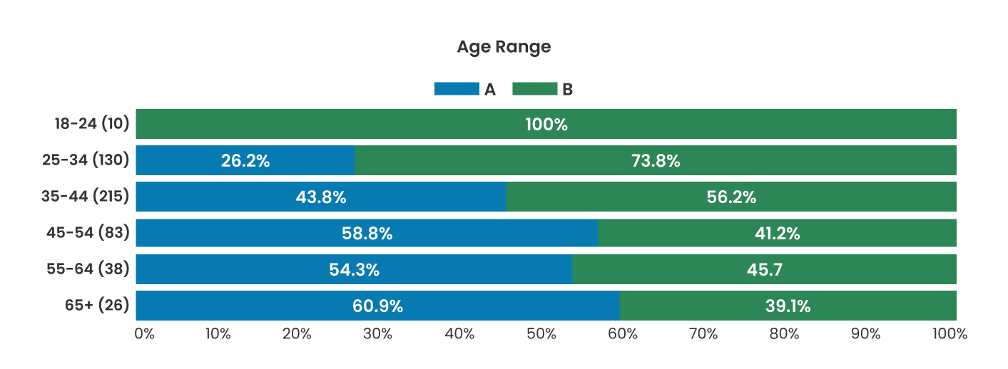
Results:
Of the 129 responses within the 25 to 34 age range, 73.8% chose our design.
Of the 215 responses within the 35 to 44 age range, 56.2% chose our design.
Quotes:
Looks less like a scam
Expressing genuine happiness
Body language and color scheme is enticing
Simple and to the point
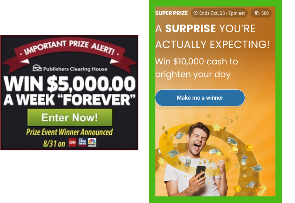
Test #2 - Head to Head
Testing Demographics (500 Responses):
Male and Females 18 to 65+; Household income $20k to $80k.
Users were asked:
Please rank the following digital ads and tell us why you made your decision.
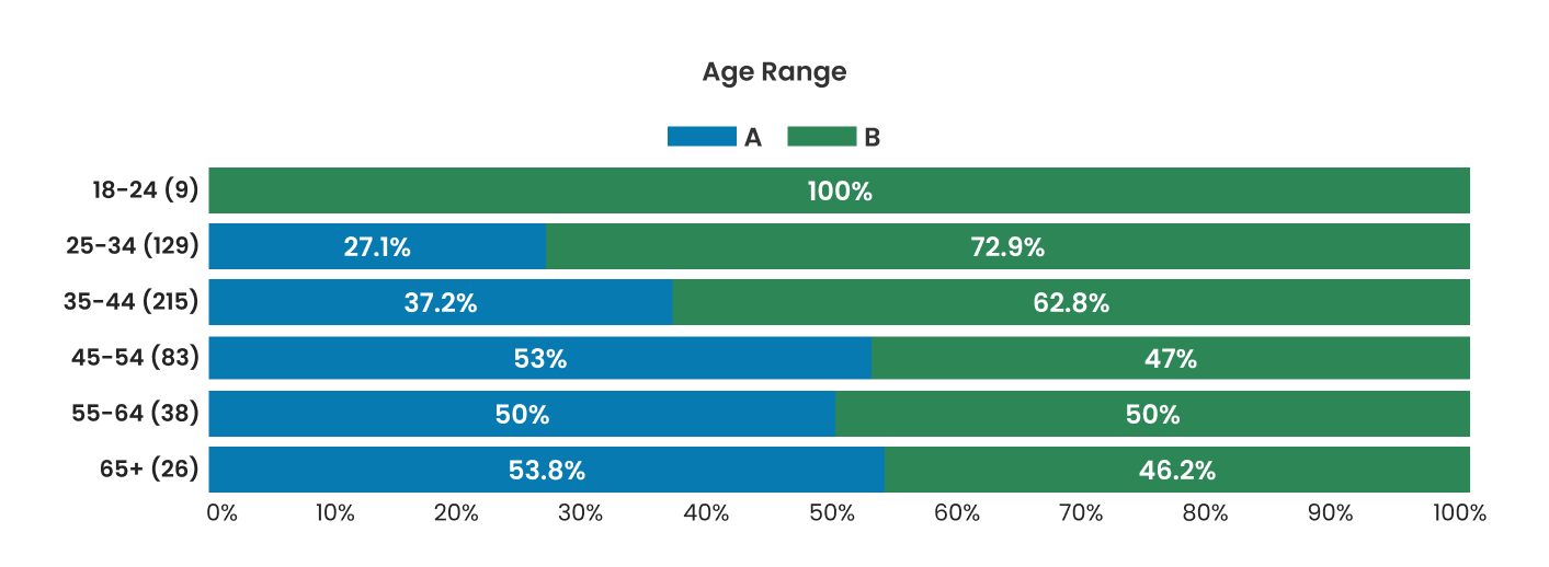
Results:
Of the 129 responses within the 25 to 34 age range, 72.9% chose our design.
Of the 215 responses within the 35 to 44 age range, 62.8% chose our design.
Quotes:
Feels legit
Man expressing genuine happiness
Body language and color scheme is enticing
Looks sincere and fun
Test #3 - Ranked Choice
Testing Demographics (500 Responses):
Male and Females 18 to 65+; Household income $20k to $80k.
Users were asked:
Please rank the following digital ads and tell us why you made your decision.
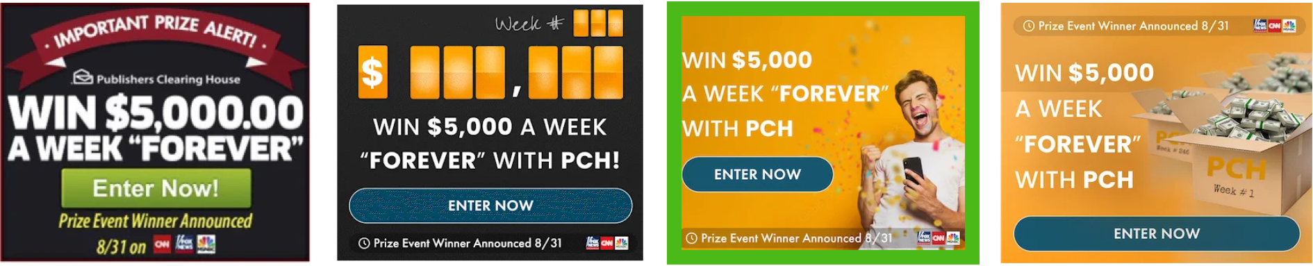
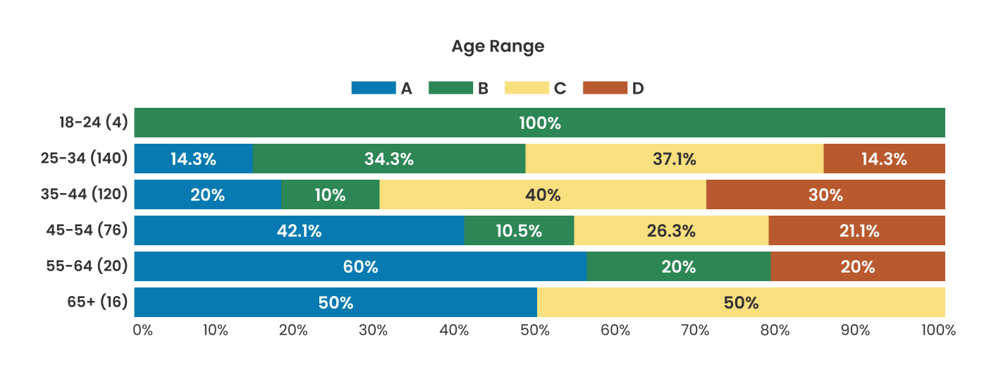
Results:
This Ranked poll had a final tally of 275 votes after 3 rounds of vote counting for Option C.
User Comments:
The possibility of excitement and winning
Man expressing genuine happiness
It feels authentic
It makes me think I could win
Next Steps - Placing ads in live experience
In order to determine the effectiveness of our new creatives, we ran an A/B test of the live site. This test took place over the course of a week using Adobe Test and Target.
the outcome - what did we achieve?
25 to 34 age range:
Time On Site : 45% increase
Entries : 55% increase
Account Creation : 65% increase
35 to 44 age range:
Time On Site : 45% increase
Entries : 55% increase
Account Creation : 65% increase
The outcome of the testing made it quite clear that the advertisements worked effectively. Beyond this, our plan was to create and use our own images (not stock photos) and replicate poses that we found to be effective.
We had also determined a testing strategy in order to determine whether or not the images captures by the advertising department would work - from there we would be able to refine and address any issues.
Conclusion
Moving Forward
Running tests and figuring out what something as abstract as “winning” was interesting, fun, and insightful. Organizing and synthesizing the data took a lot of time and required us to run quite a few rounds of tests.
I learned quite a bit about designing simple and straightforward tests in place of those I figured would require more complex and “deep” questions. When given the opportunity to talk, people will talk. In this case, the less direction we gave them the better.
Next Case Study: My Travel Agent (Project PXL)