PCH : NXP User Education Strategy
Enhance Trust and Educational Accessibility for New and Existing Users
Establishing a centralized education strategy for both new and returning users. The goal of this project to address trust related issues present in our research and, in turn, increase customer retention, engagement, and acquisition.
My Role
Product Strategy • UX Strategy • Product Design • UX Research • UI Design
Team Members
Davidson Adames - Design Lead
Christian Castellanos - Director of Product Design
Aldo Santa Ines - Director of User Experience
Methods
Design Thinking • User Requirements • User Flows • Design System Development • Usability Testing • Wire-framing • UX Strategy • UX Research • Research Synthesis • Rapid Prototyping • Mobile Design • Analytics • Creative Ideation • Data Focused Design • Personas
Project Impact
Increased customer data submission by 90% per visit and overall retention of new customers by 95%.
Project Date
October 2021 - October 2023
The Problem - No One trusts the brand
How to Enhance Trust and Educational Accessibility for New and Existing Users?
Initial user feedback identified a critical need for easily accessible information, regarding:
How prizes were entered
How winners were determined
The primary objective revolved around creating a centralized platform to educate users on the new experience while highlighting and promoting upcoming features leading up to their launch.
solution - the learn hub
Final Designs
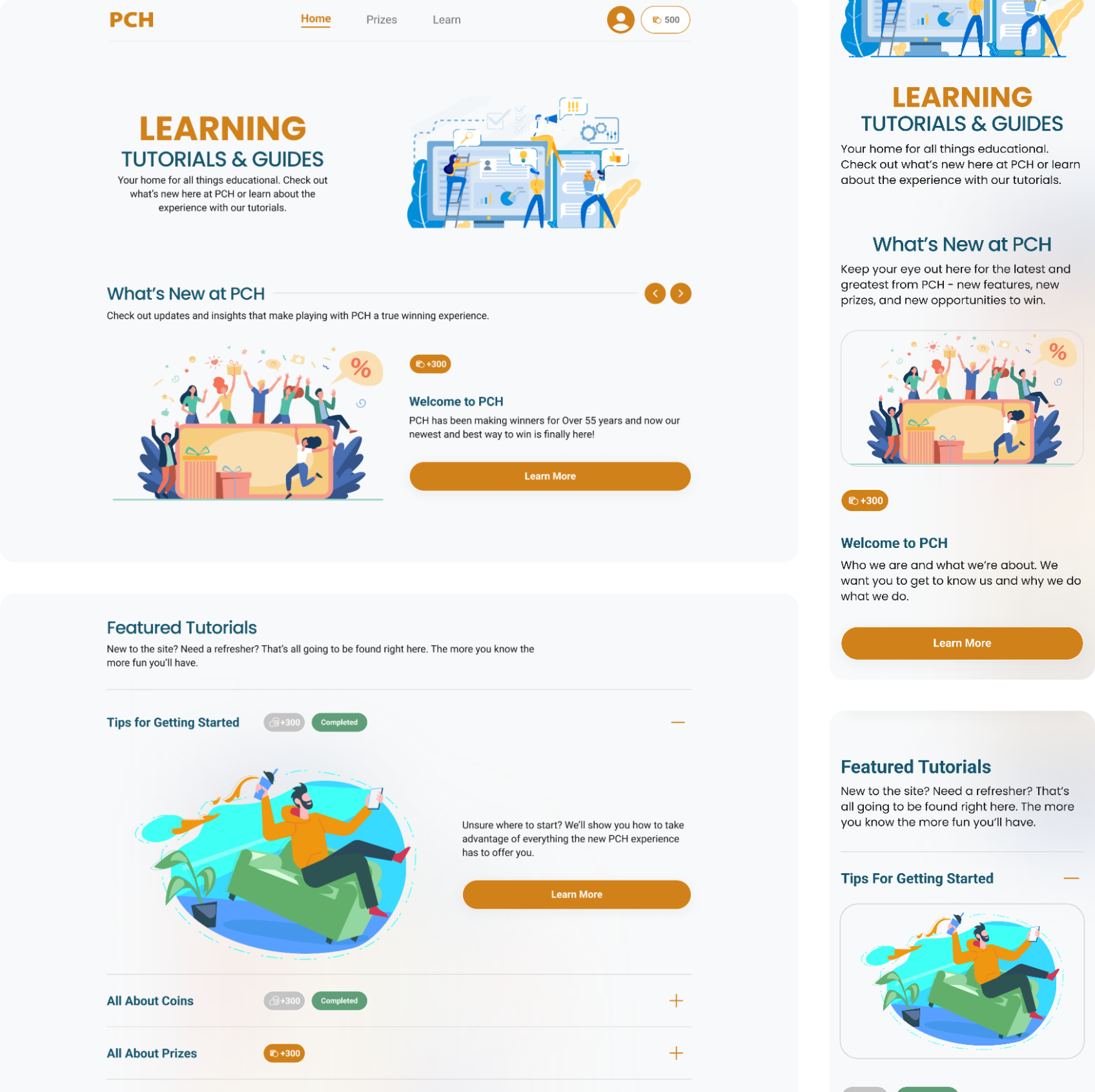
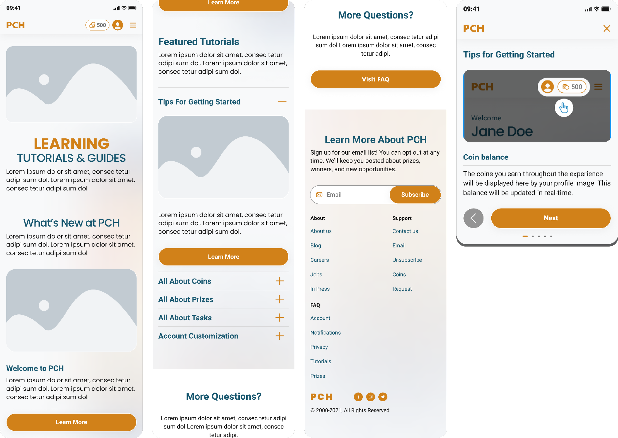
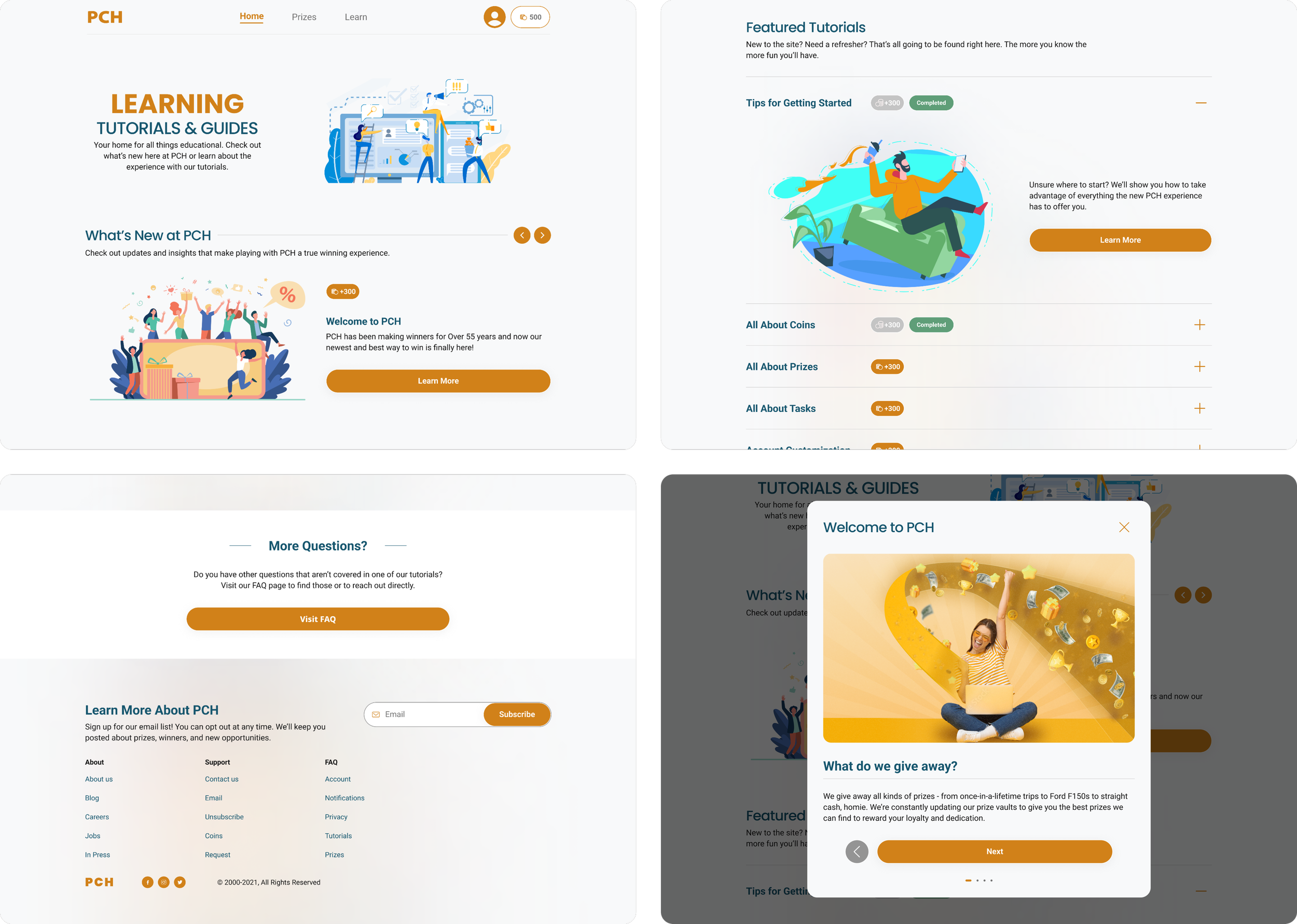
The features that appear in the final designs for the Learn Hub came about as a consequence of a significant amount of user research, ideation, and internal team discussions. All the features that made the final cut were shown in user testing to improve the user experience.
What’s New at PCH:
A carousel designed to serve as a place for new and up to date information to be presented to users. Any new announcements for the experience would be placed here.
Featured Tutorials:
Home to the most important tutorials for the education of the user. These tutorials when selected would launch screen overlays that would guide users through the multi-step tutorial.
Pills were added to inform users that completing those tutorials would offer them a certain number of coins. Upon completion the coin amount was grayed and a “completed” pill would appear to indicate that tutorial was complete.
More Questions:
A separate Frequently Asked Question page was built for more technical and legal questions.
Tutorial Overlay:
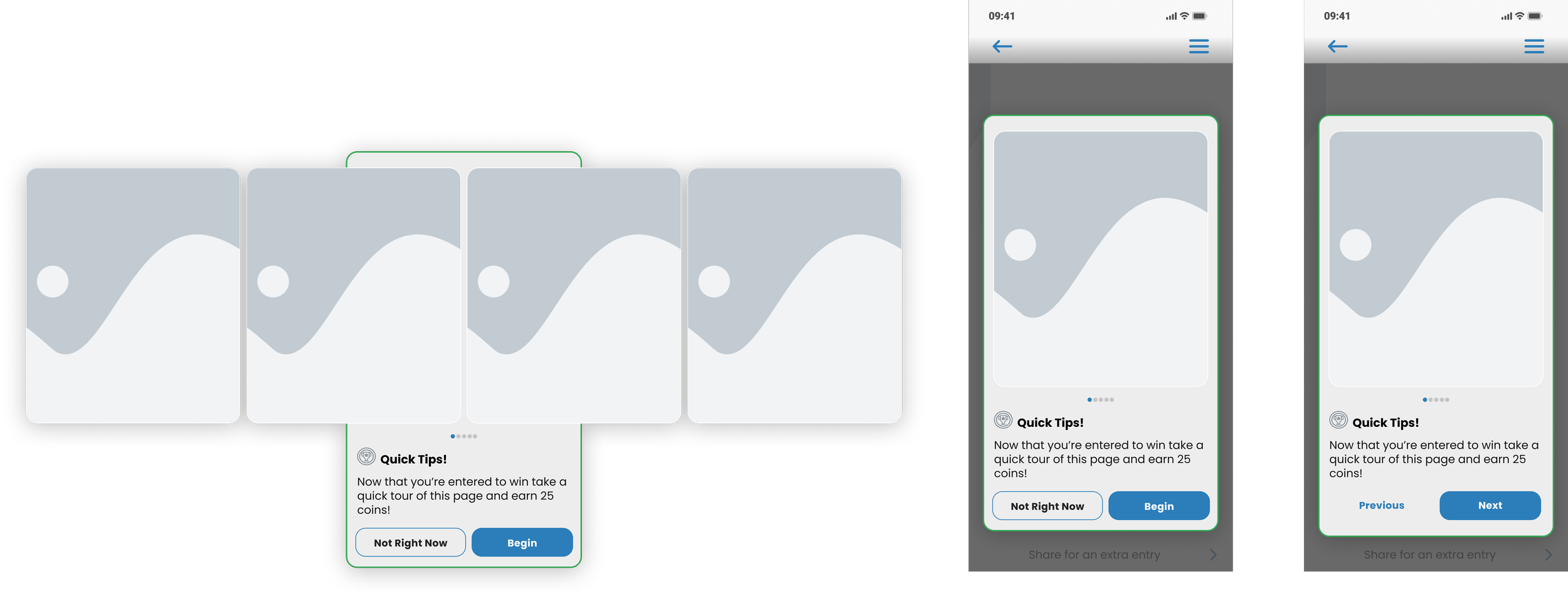
This is an example of a launched tutorial screen overlay used to educate users on the PCH experience.
The impact - Measuring the results
How did this impact the experience?
Increased customer data submission by 90% per visit
Overall retention of new customers by 95%
Increased overall favorability of the experience from 10% to 80%
The development and implementation of the educational and awareness strategy over the course of the project saw a dramatic increase in our metrics.
How I Got There - Developing a UX Strategy
What Would Best Serve Our Users?
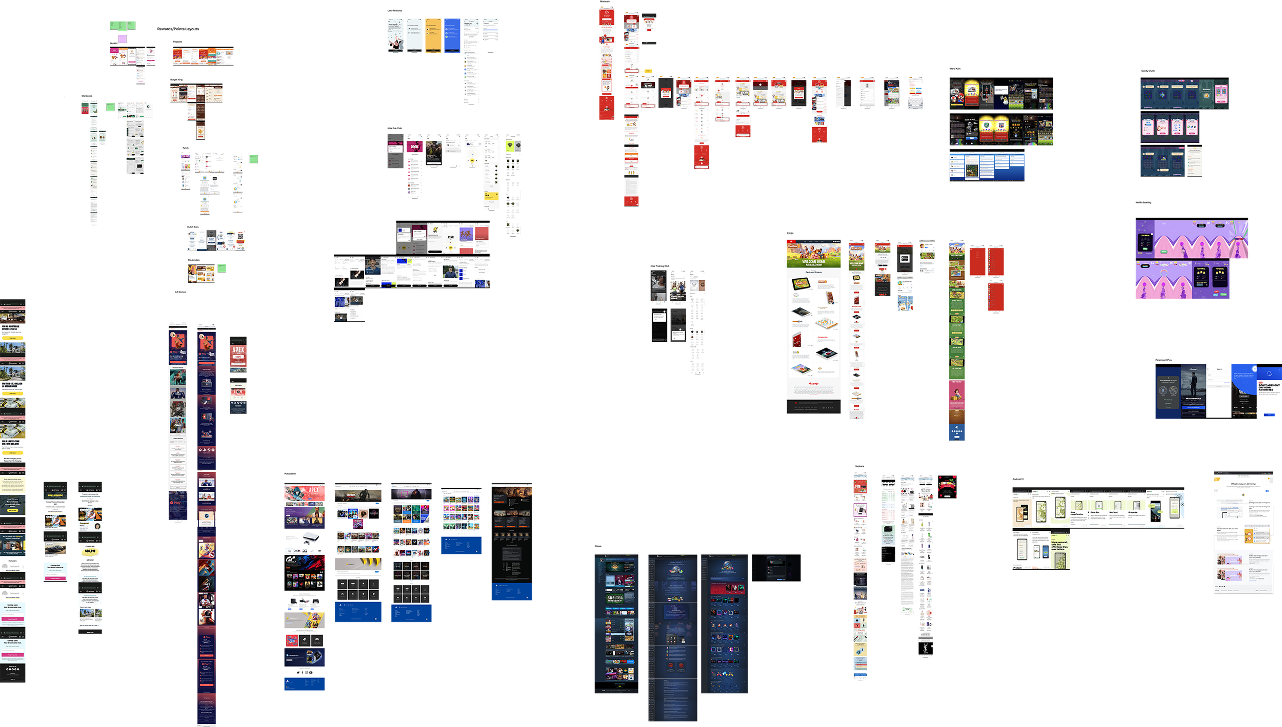
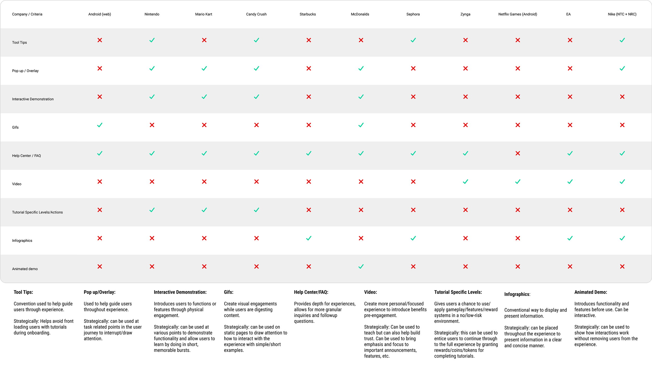
The initial phase of research constituted an extensive comparative and competitive analysis, centering on understanding the methodologies employed by various companies in educating users about new experiences or features.
The overarching question I asked myself revolved around examining how other websites and applications navigated the introduction of novel functionalities and informed their user base.
The question was: Should new information be embedded within an FAQ section or did it deserve an independent, dedicated page?
The primary focus was understanding the strategies and mechanisms adopted by industry counterparts to inform users about novel features or roll outs.
This approach sought to delineate effective user education strategies, weighing the merits of integrating such information within existing sections versus curating standalone, dedicated spaces to ensure seamless user comprehension and engagement.
The primary focus was understanding the strategies and mechanisms adopted by industry counterparts to inform users about novel features or roll outs.
This approach sought to delineate effective user education strategies, weighing the merits of integrating such information within existing sections versus curating standalone, dedicated spaces.
Once I completed my initial research stage, I was able to move forward with the project. Having already completed synthesizing the user feedback from the testing we had done on the original experience, I highlighted features within the competitive and comparative field that would begin to address the concerns expressed by our user base.
Developing the idea
Discovery and Thinking
The Learn Hub aimed to provide comprehensive tutorials guiding both first-time and returning users through the new experience. My research emphasized the necessity of complementing our experience with a hub that offered more than a traditional FAQ page.
The intent was to create a central resource that users could easily access without navigating through dense technical or legal information typically found in FAQ sections.
Unlike a static FAQ page, the Learn Hub was designed to be dynamic—a living resource that received frequent updates. It was envisioned as a space encouraging users to revisit, keeping them consistently informed and engaged with the evolving facets of the new experience.
Wireframes
Developing the Idea
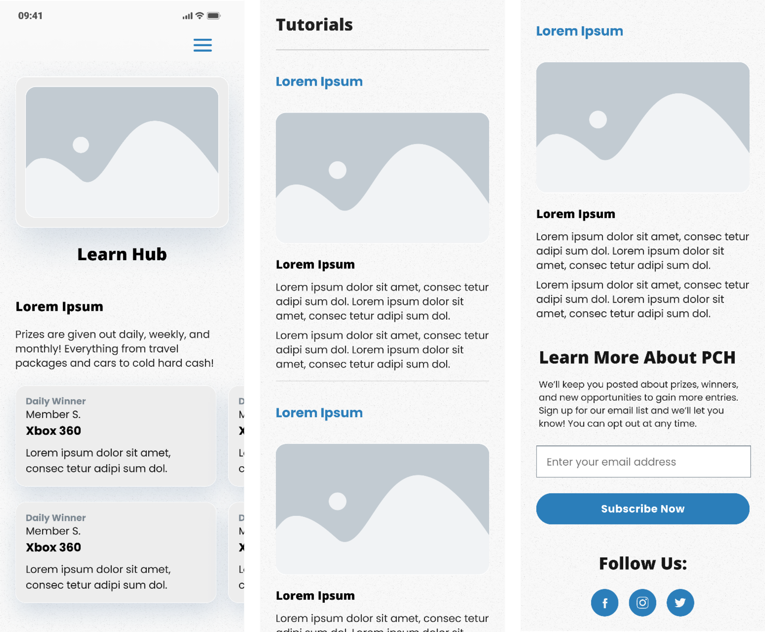
The initial iteration of the Learn Hub aimed to provide succinct tutorials—what I termed as "snap-shot tutorials." These comprised static images accompanied by explanatory text, offering insights into the new coin economy system and various prize categories.
To tackle trust-related concerns, I believed a strategic design of recent winners was required. A dedicated section was positioned above the fold, featuring an up-to-date or real-time carousel.
This interactive element displayed winners' names, basic information, and specifics of the awarded prizes—categorized as daily, weekly, monthly, or grand prizes.
This was designed to foster trust and transparency, offering users immediate and tangible evidence of real-time winners and the awarded prizes.
Wireframes 2.0
The Second Phase
Following extensive user testing and feedback, the team arrived at a decision to elevate the Recent Winners module by integrating it onto the main page, subsequently granting it a dedicated landing page for deeper exploration.
Drawing from internal discussions and informed by my competitive and comparative analysis, the Learn Hub evolved towards a more dynamic and engaging direction focused on feature announcements and the more traditional notion of education.
The new approach involved the incorporation of a "What’s New" carousel, serving as an educational tool to inform users on evolving experiences and ongoing feature developments. Internal deliberations and research further prompted the expansion of tutorials in the second iteration.
Tutorials
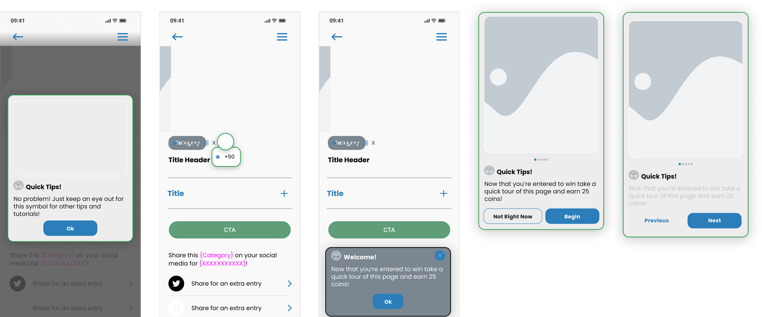
Expanded tutorials presented multi-step screen takeovers to provide users with more comprehensive guidance. One pivotal challenge addressed was the balance between content expansion and page length.
To tackle this, screen overlays were identified as a more user-friendly format for conveying information, acknowledging that users absorb information more effectively through images than dense textual content.
I used best practices from Nielsen Norman Group to help guide my decision making:
Rely less on text and more on imagery
Reward users for going through education/tutorials when possible
Tutorials can make users feel like the task being taught is more difficult
Users will forget 70% of what you tell them within a day
The integration of multi-step tutorials facilitated an improved user learning experience, fostering better retention and comprehension of content.
Once I understood what information needed to be included on the card, how it should be presented, and the way they should function, I started the actual designing. The tutorial cards went through several iterations and several rounds of feedback.
I wanted to make sure that the imagery played the most prominent role on the cards, per the NN Group, and that become my primary focus.
Version 3.0
Higher Fidelity Designs
The pivotal change in the third iteration of the Learn Hub aimed at addressing information overload and minimizing excessive scrolling. To achieve this, I introduced an accordion system for each of the Featured Tutorials.
Over the longer term, the Learn Hub was meant to grow to accommodate as many tutorials as would be necessary; however, the limit on Featured Tutorials would always be five.
final tutorial layout
Each tutorial, when closed, would only appear as a text title. When the tutorial was open there would be a card with an image and copy that reflected what that particular tutorial would cover.
Each tutorial overlay set would include a feature card, a max of four tutorial cards, and a toast card that indicated the tutorial was completed and the number of coins that the user was being rewarded.
In order to gain the reward the user would have to complete the entire tutorial and use the “Finish” call to action before the coins would appear in their wallet.
version 4.0
Final Iteration
During a reassessment of our token economy, we looked for ways to integrate coins into the user learning process. The pivotal transformation in the Learn Hub involved the introduction of two key elements: coin value pills and completion pills.
As we navigated limited options for user engagement and coin earning—integral aspects of the experience—we implemented tasks that rewarded users with coins for active site participation.
Each tutorial or "What’s New" feature became valued at 300 coins. Upon completion of a tutorial, the corresponding pill would transition to a greyed out state, with a green pill affirming completion.
Crucially, the design and affordance retained its interactive nature, allowing users to revisit completed tutorials if desired, maintaining a consistent and clear pathway for ongoing user engagement.
Insights & Conclusion
What I Learned
User feedback and internal brainstorming sessions played a crucial role in shaping the evolution of the Learn Hub. Initially conceptualized as a dynamic and evolving platform, the Learn Hub was envisioned as a central resource for both new and returning users to remain abreast of the site's latest developments.
The goal was to establish this as a frequently visited page, given the continuous implementation of new features and ongoing site development.
Drawing inspiration from extensive research into other user experiences and fortified by user feedback, the Learn Hub gained prominence as a vital page within the site. Throughout its development, user feedback was instrumental in ensuring that the page aligned with its intended objectives.
This collaborative approach—leveraging feedback and ideation—was integral to its evolution, playing a pivotal role in shaping the Learn Hub into the robust resource it ultimately became.
Next Case Study: A New Winning Experience
